


I carried out a personal end-to-end UX/UI design project, driven by curiosity around a personal pain point of mine- that is, experiencing decision paralysis when trying to decide on a leisure or recreational activity.
Project Background
My role:
UX/UI Designer
UX responsibilities:
• Surveys (questions, format, distribution)
• User Interviews
• Desktop Research
• Synthesising Research Data
• Facilitating Co-design / Ideation Workshops
• Minimum Viable Product (MVP)
• Information Architecture
• UX Copy, Content & Writing, Proof & Editing
• Usability Testing Workshops
UI responsibilities:
• Sketching UI & Wireframes
• UI Prototyping & Iterations (low, medium & high fidelity)
• Accessibility Analysis (W3C WCAG 2.1)
• Heuristic Evaluation
Tools: Figma, Figjam, Trello, Photoshop, Figjam, Pen & Paper, Zoom
Platform: iOS & Android (88% of survey respondents prefer using smartphone)
Duration: 2 Months
“Aussies looking for a leisure activity in the limited time they have, feel anxious that they cannot discover a suitable choice.”
Initially, I worked off a few assumptions I aimed to validate through research down the line:
Problem Statement (Initial)
People are stressed by the vast availability of options for leisure & recreational activities out there.
People want the the process of looking for leisure activities to be ‘automated’ to save time. (Including being suggested activities)
People are too time-poor and busy to trawl through search results to find the perfect leisure activity.
After mapping out my problem statement, I carried out the following research to better understand how people feel about leisure activities:
Discovery / User Research
Surveyed 83 enjoyers of leisure & recreational activities
Conducted 8 1-on-1 Interviews
Analysed 8 Competitors
Desktop Research

Upon summarising & synthesising the quantitative & qualitative insights gathered from the research, I uncovered that people engaging in leisure activities commonly shared the follow habits, needs & pain points in that they:
Want to be suggested new, interesting activities (based on personality, habits etc.)
See online reviews & ratings as untrustworthy.
Find online information on activities to be sub-optimal (option overload, missing + outdated + duplicate information etc.)
Dislike the process of finding activities as it was too time-consuming & inefficient.
Prefer finding activities through word of mouth from friends & family.
Find organising activities for groups frustrating (juggling different requirements, unresponsive guests etc.)
In terms of demographics, my survey consisting of 83 respondents found that 86% were aged 18-44, 46% are students, 79% are working & 88% prefer using mobile to find activities.

Upon taking a step back to soak in all the research & realising my target demographic, I came to realise a pivot in the problem space and thus a new problem statement:
Problem Statement (Pivot)
Gen-Z & millennial Aussies looking for a leisure activity, require better processes and access to quality reviews & information, to assist them in making more suitable choices.
After defining the new problem statement and collating the research, I synthesised all this down into 2 sets of personas & journey maps to succinctly summarise & present the data through a more human-centred and empathic lens. The primary persona is Colleen, representing our working millennials, while Kevin represents the younger Gen-Z student demographic:
Defining the Problem


Once my personas & journey maps for Colleen & Kevin were defined, I gained a clearer understanding of the problem space. I then proceeded to brainstorm and settled on 2 ‘How Might We’ statements to bring into ideation workshops with Colleens & Kevins in order to generate real solutions to improve the way activities are found:
How might we... streamline the processes used to find & plan activities?
How might we... improve access to authentic & quality reviews & information on leisure activities?
I hosted multiple ideation workshops with 8 Colleens & Kevins, running through a couple of activities (crazy 8s & brainstorms) with the HMW statements as prompts. Dozens of ideas were generated, voted on, then mapped onto a minimum viable product (MVP) matrix.
Designing the Solution


The best features (high impact features) were then plotted onto an information architecture. A couple of user flows & a storyboard were also created to better illustrate how the ideated solutions would work in real-life scenarios.


With my information architecture, user flows & storyboards in hand, I proceeded to sketch and wireframe the design solutions, taking care to focus on outlining features without worrying too much about cleanliness. The primary features outlined as high-value in the MVP included a map, keyword-search buttons, activity planning functionality & activity preference inputs to personalise the search functionality.


Once I sketched & wireframed the main high-value features outlined in the MVP, it was time to prototype them in Figma.
I started with a low-fidelity prototype devoid of colour & logo, which was done to minimise distraction & bias in testing. This low-fi prototype was then tested with 4x Colleens & Kevins which generated insights and feedback which would go on to inform the prototype’s iteration up to medium-fidelity. This cycle would be repeated again to create the high-fidelity prototype.
Further, all prototypes were created with adherence to W3C WCAG 2.1 accessibility guidelines (including AA rating for colour contrasts) while adhering by the Nielsen design heuristics.
Delivering the Solution


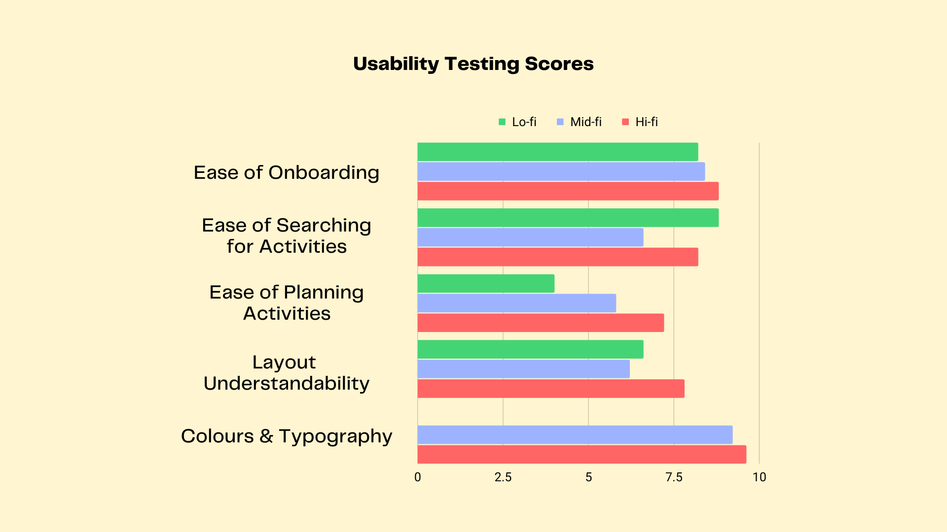
The prototype was tested in 3 seperate stages with 4x Colleens & Kevins, once at each fidelity (low, medium & high). Colours & final typography were implemented from the medium-fidelity prototype onwards. Scores were collected on a Google-form survey to quantify the prototypes’ ease of use, intuitiveness & aesthetic. Overall, the prototype improved in most areas as it progressed in fidelity, except in the area of ease of searching for activities, which might’ve been attributable to colours & visual design elements obscuring the search functionality.
Usability Testing

During the medium-fidelity prototype testing, 3x Colleens & Kevins noted that there were too many features on the home page. I suspected that implementing the colour & visual design elements created cognitive overload which reduced the intuitiveness of the platform. For the high-fidelity prototype, I reconfigured the information architecture to ensure the main landing page only had key features (outlined by clarifying with Colleens & Kevins in the testing workshops) to streamline the experience. These changes implemented in the medium-to-high fidelity prototype iteration saw in increase in scoring by 11 points on the average SUS scale.

Prototype
The prototype can be tested above
(Please ensure you toggle fullscreen by clicking the icon located top-right inside the frame;
this prototype can also be used on iOS or Android if you have the Figma app installed)
Or simply click here to open the prototype in a new window!
As I wrapped up the first phase of the project, these next steps were identified as areas to focus on for the next phase:
Next Steps
Build a desktop web version of the platform, as surveys found 66% of Fora AHAs like using desktop to plan & search for activities. (Short-medium term)
Further testing and iteration of the prototype to ensure the features are polished and optimised for our Colleens & Kevins. (Ongoing)
Looking back, I identified some areas which I could’ve improved on to ensure a better project delivery:
Retrospective
Focusing on only primary persona:
As I chose to also utilise a secondary persona to represent the next most significant demographic, this effectively doubled the workload for such a short project span. In turn, this might’ve affected the quality of the design solutions created for the primary persona who represented majority of my demographic (Colleen).
Feature Creep:
Many strong features were ideated during the co-design workshops and I tried to design & implement most of them, which translated into feature overload in testing workshops. I might have benefited from a triage via intensive card-sorting workshops earlier on to define & implement the most important features first, then focusing on the next most important features in a future phase.